
We’re taking a closer look at the UI and UX design of Final Fantasy 16. To better understand game UX design, it’s helpful to explore how different games approach their designs—what works well and what could use some improvement.
Final Fantasy 16 is part of the legendary Final Fantasy franchise. This series has been around for decades and has evolved across multiple platforms, from Nintendo NES to PlayStation. The beauty of the Final Fantasy series is that each game tells a completely unique story with new characters, so you don’t need to play the previous installments to enjoy the latest one. You can jump into Final Fantasy 16 without any prior knowledge of the past games—each entry stands on its own. Every game offers its own adventure, with varying play-through lengths, from shorter experiences to much longer ones.
The summary of Final Fantasy 16’s plot:
You play as Clive, a character caught in a complex medieval like world where family conflicts and political intrigue unfold across diverse regions. As with most Final Fantasy titles, there’s a classic good-versus-evil narrative, filled with epic fantasy elements like – crystals – and larger-than-life battles.
Since Final Fantasy is one of the most iconic RPG franchises out there, it’s fascinating to look at how Square Enix, a Japanese developer, has incorporated western design principles into Final Fantasy 16. Traditionally known for their JRPGs, Square Enix has adapted and evolved by blending both cultures’ design philosophies. We’ll take a closer look at how that influenced the UI and UX of this game.
Controls and Layout:
One thing I really like is how the button prompts stand out clearly against the controller illustration. They’ve used a sans-serif font for these texts, which is much easier to read at smaller sizes compared to the serif font on the splash screen.
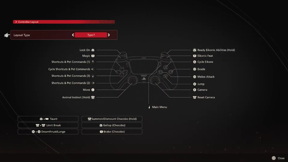
The game provides preset layouts for different playstyles, which is a thoughtful touch. It also includes a customizable controller mapping option, making it adaptable to different players’ preferences. For players who don’t want to spend time tweaking controls, the presets work great, while those who prefer custom setups have the flexibility to make adjustments.
For actions requiring two buttons simultaneously, like Break, Taunt, or Launch, they’ve grouped these on the lower half of the controller layout. This makes it clear and intuitive, even without specific headings. I also appreciate how the layout aligns closely with how the buttons are positioned on the physical controller. For example, paired actions like pressing L3 and R3 or X and Square are grouped together, making them easier to remember and execute during gameplay. They’ve avoided pairing buttons like X and R2, which are harder to press simultaneously and less intuitive.
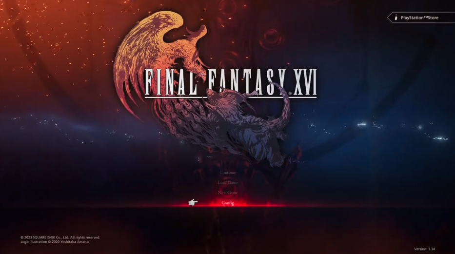
Another point I appreciate is the minimal background noise in the controller mapping screen. While there’s a subtle fiery effect at the bottom, it doesn’t distract from the text or controls. They’ve done a great job using red as a highlight color. Normally, red can be tricky to work with because it’s often associated with warnings and can be hard to pair with other colors. However, in this case, the red works seamlessly as a selection highlight and for title effects. It’s bold but doesn’t overwhelm the screen, making it both visually striking and functional.
Systems Settings:
Now we’re looking at the System Settings screen, which can be accessed right away from the splash screen. This is a great feature because it allows players to configure their gameplay settings before they even start playing. This is particularly useful for players with specific needs, like those using PlayStation’s Access Controller, who may need to remap controls to suit their preferences.
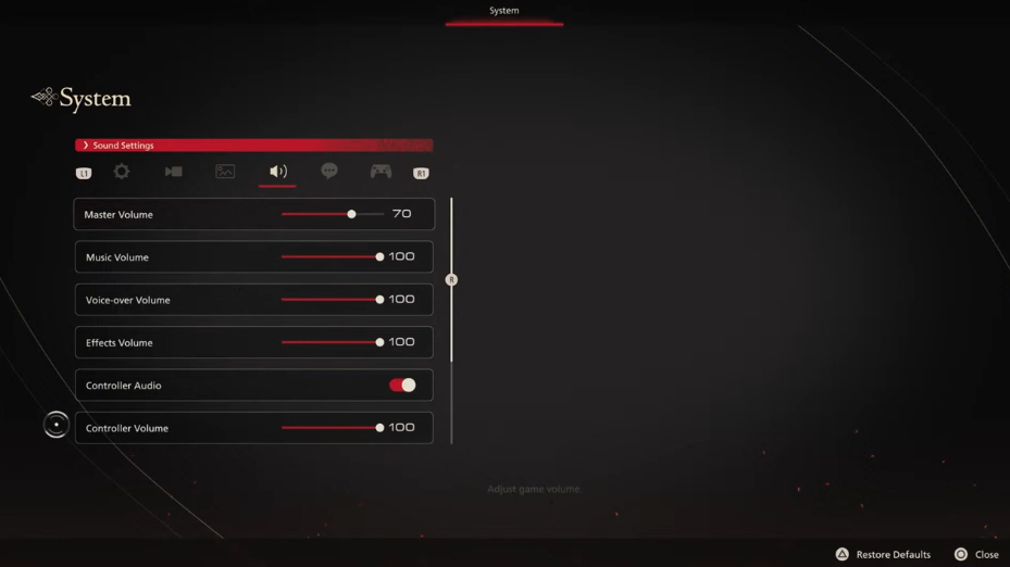
The settings also include audio options, so you can tweak the sound for your headset or speakers, as well as subtitle settings. Personally, while I don’t have a hearing impairment, I always enable subtitles in every game. Subtitles help me keep track of what’s happening, especially when characters have unique accents or pronunciations I’m not used to, or when there’s a lot of background noise. Subtitles make it easier to follow the dialogue and gameplay at the same time.
The System Settings also allow adjustments for camera sensitivity, which is great for players who might experience nausea from excessive camera movement. Additionally, there are graphics settings tailored to your hardware, letting you optimize the game for your device. Some games even include warning labels for visual effects that could trigger seizures, which is a thoughtful and important feature for accessibility.
One thing I noticed about the System Settings menu is the cursor-based navigation. Instead of the default navigation using the left stick (L-stick), the game relies on a cursor-like experience. While this design may be more intuitive for cross-platform games—where players use a mouse and keyboard on PC, as well as controllers on consoles—there are some issues with its implementation.
The cursor sometimes wobbles awkwardly when navigating menus. This can be disorienting, especially in slower menus like the System Settings. It feels inconsistent—sometimes the screen is steady, and other times it wobbles unnecessarily, which can be a bit nauseating. It also doesn’t help that the fonts used in the menu are quite small, making it harder to see what’s being selected when the screen isn’t steady. I’m not sure if this is a bug or a deliberate design choice, but I hope it’s something they address in the future.
Save System:
The game features a manual save menu, which is something I have mixed feelings about. On one hand, I’ve gotten used to modern games with automatic saves, which eliminate the need to worry about saving progress. On the other hand, Final Fantasy games have always been strategic, and manual saves can be helpful when you need to prepare for specific challenges—like saving before a tough boss fight, heading back to town for potions, and then continuing your adventure.
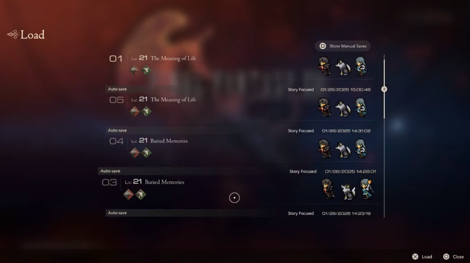
Fortunately, the game also includes an automatic save system that records your last checkpoint, so you get the best of both worlds.
One small detail I really love is how the game incorporates pixel art in parts of the UI. Despite the game’s highly detailed, realistic graphics, these pixel characters pay homage to earlier Final Fantasy games. It’s a thoughtful design choice that shows respect for the franchise’s history while blending it with modern aesthetics. It’s a subtle, yet meaningful touch that I really appreciate.
Game Map Overview:
Alright, now we’re looking at the game’s map system. There are actually two maps in the game: a local map that shows your immediate surroundings and a world map that gives you a broader view of the game world. This is an intuitive design choice, commonly seen in RPGs, and it works well here.
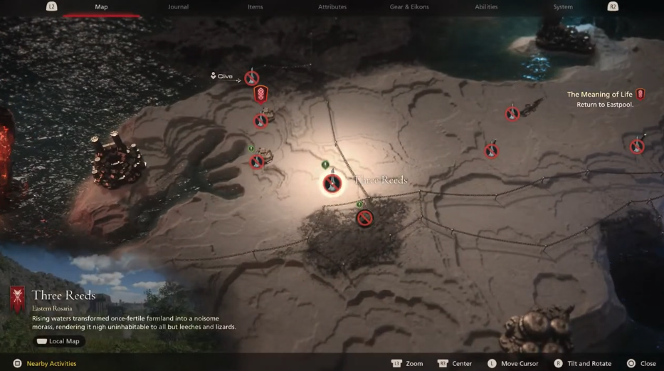
One thing I appreciate is that the map overlays the gameplay rather than completely replacing the screen. Normally, I’m not a fan of this approach because it can sometimes feel like a shortcut rather than a well-thought-out design decision. However, in this case, it makes sense—when viewing the local map, it still feels like you’re present in the world, which adds to the immersion.
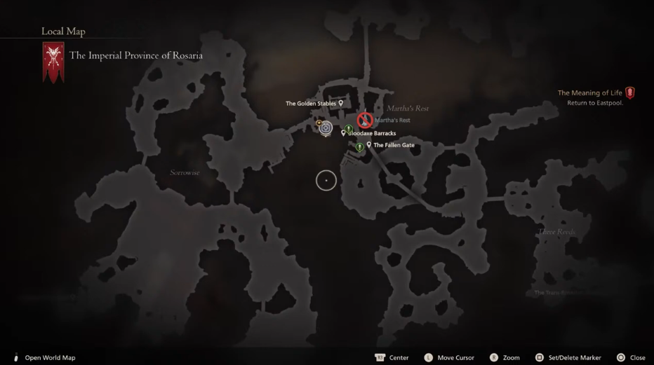
UI elements on the map are also well-placed. The top-right corner displays your objectives, while the top-left tells you which area or province you’re currently in. At the bottom, you have the option to switch between the local and world map. I also like that this option stands out visually from other navigation prompts. Even though the button for switching maps is on the right side of the controller, having it placed on the left side of the screen is fine because in most games, returning to the previous screen is usually mapped to the left side.
Journal and Quest:
Now, moving on to the journal UI. My main concern here is the readability of the text. The labels for completed quests and in-progress quests are very small, making them difficult to read, especially when playing on a TV from a distance.
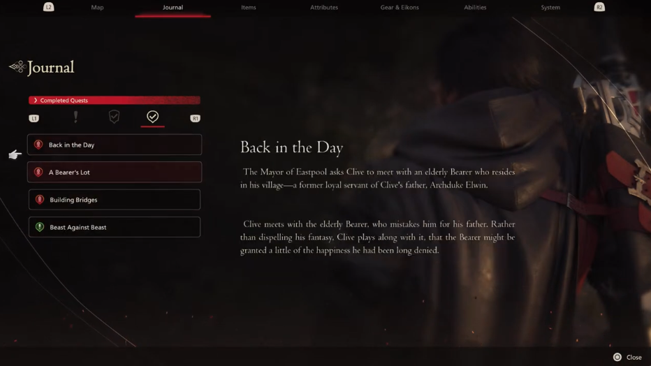
The quest list and storyline descriptions are also affected by this issue. While I understand that some elements are intentionally blurred or censored to avoid spoilers, the font choice for the body text isn’t ideal. They’ve opted for a serif font, possibly a transitional or modern typeface, which doesn’t read well against a busy background. A humanist font with a higher x-height and more consistent stroke weight would have been a better choice for readability.
Another issue is the iconography for main and side quests. While they do use different icons, the shapes are very similar, making them hard to distinguish at first glance. The primary difference is color—red for main quests and green for side quests—which isn’t ideal for players with red-green color blindness. A better approach would have been to use different silhouette shapes for each quest type to create a clearer distinction.
Navigation and Interaction Design:
I like the overall navigation system, but I do wish that the main navigation tabs at the top were mapped to L1 and R1 instead of L2 and R2. Most games use L1/R1 for primary navigation and L2/R2 for secondary submenus. The current setup feels slightly unintuitive, as I instinctively press R1 instead of R2 when switching tabs.
That said, the interaction design is well thought out. The tapping navigation and deep navigation system are smooth, and the overall layout follows a left-to-right reading pattern, which is standard for western audiences. Even though this is a Japanese-developed game, they’ve clearly designed the UI with a global audience in mind.
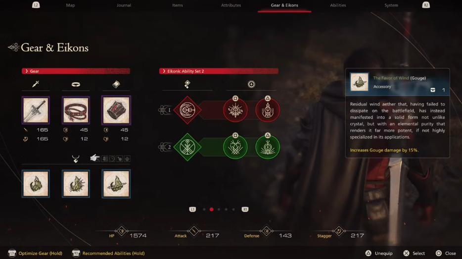
One small confusion I had was with the Eikon ability selection. The square and triangle symbols appear next to abilities, which initially made me think I needed to press those buttons to select them. In reality, they are just indicators of how the ability will be mapped in-game, not an interactive selection prompt. It wasn’t immediately clear, but once I figured it out, the system made sense.
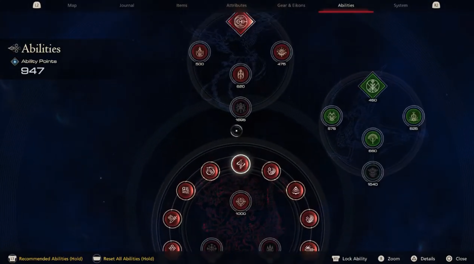
Overall, the ability selection screen is well-organized. I currently have three or four abilities unlocked, and they are easy to access using the same navigation structure as the map. There are quite a few “hold” interactions in the game, but since the UI consistently labels these actions, it never felt confusing.
HUD – Heads Up Display and Combat UI:
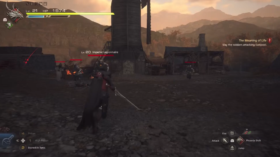
Now let’s talk about the HUD (Heads-Up Display). I appreciate that it doesn’t clutter the screen unnecessarily. Instead, UI elements appear dynamically, depending on the gameplay situation. For example, during combat, abilities and status indicators appear only when needed. This aligns well with the game’s immersive combat system, which blends cinematic storytelling with real-time action.
However, one thing I don’t like is how tiny the icons are on the top bar. Some of them are hard to recognize, and it’s not immediately clear what they represent.
I do like how the UI layout mirrors the controller layout:
- Combat achievements appear on the right side, keeping them visually close to the objectives.
- L2-related abilities and status bars are at the top.
- D-pad-related inventory items are placed on the lower-left side.
- Action skills mapped to the face buttons are displayed on the right side.
- Objectives are in the top-left corner, which makes sense because characters often face toward the right side of the screen.
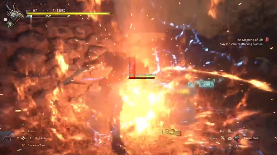
That said, I feel the combat UI can get overly cluttered, particularly with damage numbers constantly popping up. While I understand that damage numbers help communicate attack effectiveness—changing color to indicate critical hits or weak attacks—there’s just too much happening at once.
Additionally, enemy indicators appear as red diamond-shaped icons with arrows. While I appreciate the need to keep track of enemies, the arc shape around the diamond makes the indicator larger than necessary, adding to the screen clutter. Considering how visually intense combat already is—with fire, electricity, and special effects everywhere—the UI could have been more minimalistic in this area.
Summary:
Overall, Final Fantasy 16’s UI isn’t perfect, but it successfully blends western game design principles with the classic Final Fantasy aesthetic. I appreciate the dark medieval style and beautiful transitions, especially the loading screen animations with rotating symbols—those look fantastic.
However, font readability remains a major issue, especially for smaller text elements. Many parts of the UI use a thin transitional serif font, which is difficult to read from a distance. I often had to move closer to my screen just to see certain text.
Despite the busy HUD in combat, I still really enjoy the game. The gameplay feels fresh, and Square Enix took a bold step outside their comfort zone with this entry. Final Fantasy 16 is shaping up to be one of my favorite instalments in the series.